|
Phase-Plane Plotting of the Goods Index | |
Expertise: Intermediate
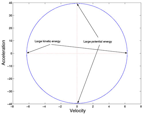
The Phase-plane Plot of Acceleration Versus Velocity
We use the phase-plane plot, therefore, to study the energy transfer within
the economic system. We can examine the cycle within individual years, and
also see more clearly how the structure of the transfer has changed throughout
the twentieth century.
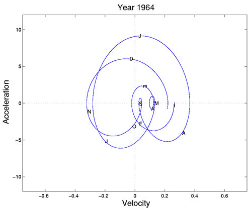
The largest cycle begins in mid-May (M), with positive velocity but near zero acceleration. Production is increasing linearly or steadily at this point. The cycle moves clockwise through June (first J) and passes the horizontal zero acceleration line at the end of the month, when production is now decreasing linearly. By mid-July (second J) kinetic energy or velocity is near zero because vacation season is in full swing. But potential energy or acceleration is high, and production returns to the positive kinetic/zero potential phase in early August (A), and finally concludes with a cusp at summer's end (S). At this point the process looks like it has run out of both potential and kinetic energy.
The cusp, near where both derivatives are zero, corresponds to the start
of school in September, and to the beginning of the next big production cycle
passing through the autumn months of October through November. Again this
large cycle terminates in a small cycle with little potential and kinetic energy.
This takes up the months of February and March (F and m). The tiny sub-cycle
during April and May seems to be due to the spring holidays, since the summer
and fall cycles, as well as the cusp, don't change much over the next two years,
but the spring cycle cusp moves around, reflecting the variability in the timings
of Easter and Passover.
| |